Visual identity
01
Halde Museum
Identity — 2026
Type design
Client
Self-initiated, retail release
Year
2021 — 2024
Role
Type designer
Services
Type design, specimen, licensing

(01) Brief
Most grotesques look good at one size. Keller Grotesk started as a custom face for a single book and grew into a family meant to work from 9pt captions to building-height signage.


(02) Approach
Every glyph was drawn at text size and proofed on paper before any display tuning. Apertures are slightly open for small sizes, and the display cuts tighten spacing without changing the letter shapes.
06
Weights
612
Glyphs per weight
31
Languages supported

Fig. 04
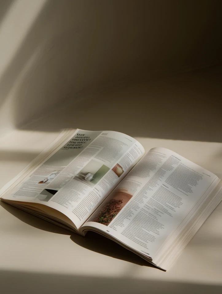
Specimen spread showing all six weights at display size.